
Small Spaces, Lavish Finishes
Welcome! Today we explore premium material palettes for compact interiors, turning modest footprints into quietly luxurious sanctuaries. Expect practical strategies, real-world anecdotes, and designer-backed tricks that favor durability, light, and harmony without clutter. Share your floor plan in the comments, subscribe for weekly case studies, and vote on our next room challenge so we can tailor guidance to your exact square meters and lifestyle.

The Quiet Rules That Make Luxury Feel Spacious
Elegant small homes succeed when materials respect scale, amplify light, and endure daily use. Think large-format surfaces that reduce seams, forgiving finishes that shrug off fingerprints, and tones that link rooms. In a 28-square-meter studio we renovated, switching to honed porcelain slabs, satin brass details, and pale oak floors reduced visual noise, immediately making the hallway feel longer and the kitchen brighter without moving a single wall.

Compact Stone Strategies
Choose slim porcelain or sintered stone with restrained veining to deliver a refined look without heavy maintenance. Oversized tiles minimize grout lines, creating calm planes in tight kitchens and baths. Honed or leathered finishes diffuse glare, while wrapped window sills and thresholds carry continuity that visually lengthens corridors and anchors transitions between zones.
Lean Lines in Timbers
Select narrow boards or herringbone patterns in light, warm oaks to stretch sightlines. Engineered planks with micro-bevels read seamless yet install easily in older buildings. Low-sheen UV oils feel natural, resist scuffs, and pair beautifully with pale walls, allowing brass or blackened pulls to sparkle rather than compete with bold grain movement.
Metals that Breathe
Use satin or brushed metals where hands frequent, reserving polished accents up high to catch light and draw the eye upward. Slim edge reveals in stainless or bronze outline cabinetry with precision. Repeating one finish for taps, lights, and handles simplifies decisions, keeps maintenance predictable, and reinforces a coherent, soothing visual rhythm.
Color Choreography and Tactile Layers
Adopt a 60-30-10 balance: dominant light neutrals, supportive mid-tones, and a small metal or stone accent that glints. Keep undertones aligned—warm with warm, cool with cool—so daylight and artificial light do not cause surprises. This discipline simplifies shopping, accelerates decisions, and protects compact layouts from visual chaos masquerading as personality.
Combine matte walls with subtly lustrous textiles and finely ribbed surfaces to bounce light delicately. Bouclé, brushed cotton, and seagrass add comfort without bulk. Avoid chunky weaves that crowd corners. When every centimeter matters, thin-edge frames, slim skirting, and shallow wall panels deliver inviting tactility while honoring clearance for doors, chairs, and knees.
Carry the same floor tone into the kitchen toe-kick and entry plinths to remove visual breaks. Align door heights and curtain drops to one horizon line. Repeat a signature stone on a shelf, table insert, and niche back, building a quiet echo that subtly enlarges the perception of width and height.
Clever Shine and True Matte

Reserve sheen for cabinet uppers, ceiling details, and small metal trims, ensuring glare never lives where hands and eyes rest longest. Pair with velvety wall paints and honed counters that photograph beautifully and forgive smudges. The interplay reads intentional, sophisticated, and noticeably spacious when daylight moves across surfaces from morning to evening.
Seamless Skins for Serenity

Continuous microcement or resin floors reduce thresholds that trip the eye and the feet. Integrate baseboards into the wall finish, then notch cabinetry to hover slightly, revealing a delicate shadow line. With fewer breaks and fewer materials, cleaning becomes faster, acoustics improve subtly, and every corner feels considered rather than compromised.
See-Through Without Visual Noise

Choose reeded or frosted glass for wardrobe doors and interior windows to borrow light between zones without broadcasting contents. Slim bronze or powder-coated frames maintain elegance. When paired with tidy storage habits, the soft diffusion protects calmness, lets plants thrive, and preserves privacy for beds, desks, and early-morning coffee rituals.
Stone, Wood, and Metal: The Refined Trio
Luxury in tight quarters prefers quiet hero materials performing in concert. The right stone tone anchors, the right wood grain warms, and the right metal finish adds sparkle without glare. By limiting the palette and repeating touchpoints, maintenance shrinks, budgets focus, and rooms photograph convincingly larger than their actual dimensions.
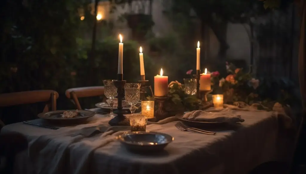
Light as the Fourth Material
Lighting reveals every decision you make. Layered sources can flatter textures, hide imperfections, and elongate walls. In compact homes, warm-dim technology and shielded optics prevent harshness, while slim profiles keep ceilings calm. Tuned correctly, light collaborates with stone, wood, and metal to tell a coherent, welcoming story from dawn to night.
Recessed coves, wall grazers, and hidden LED strips create an enveloping glow that reduces contrast and makes edges feel farther apart. Choose 2700–3000K color temperatures with high color rendering to honor material tones. Dimmers extend mood control, while indirect light on pale ceilings visually lifts height without intrusive fixtures or glare.
Position under-cabinet lights toward backsplash planes to avoid hot spots on counters. Use linear fixtures with diffusers so stone textures read gentle, not harsh. In wardrobes and desks, sensor lights preserve tidiness and save energy. A unified profile language across rooms quietly signals intention, helping compact interiors feel curated rather than improvised.
Highlight art, textured plaster, or a special stone vein with narrow-beam spots. Backlight fluted glass cabinets so objects become silhouettes instead of clutter. Use portable lamps on window stools and nightstands to build intimacy. These gentle moments encourage slower evenings, clearer surfaces, and the habit of placing belongings with care.

Built-Ins, Hardware, and the Art of Hidden Volume
Storage design determines whether premium finishes feel effortless or endlessly tidied. Tall, shallow cabinets, pocket doors, and integrated benches free floors and eyes. When hinges, tracks, and handles echo the same metal family, the result reads bespoke. Thoughtful interiors keep counters clear, allowing beautiful surfaces to breathe and light to do its best work.
Wall Beds and Foldout Niches
Modern mechanisms let beds disappear behind fluted panels or stone-look doors, revealing desks or lounge zones by day. Choose soft-close hardware and reinforced walls, then match surrounding veneers so the transformation feels magical, not mechanical. Careful cable routing, integrated lighting, and slim handles complete the illusion while preserving restful vibes at night.
Handles, Edges, and Touchpoints
Decide early between push-to-open minimalism and crafted pulls that invite the hand. Slim back-plates protect delicate veneers, while knurled textures add grip and sparkle. Chamfered edges soften collisions in narrow corridors. Matching metal tones across rooms, even on door stops and hooks, maintains quiet continuity that residents feel more than notice.
Tiny Entry, Big Welcome
Start with a durable stone or porcelain threshold, then transition to warm wood planks that run unbroken into living areas. A slim console, mirror, and concealed shoe drawer handle daily routines. Overhead, a gentle wash of light keeps jackets and umbrellas tidy, signaling calm before the home fully unfolds.
All Rights Reserved.